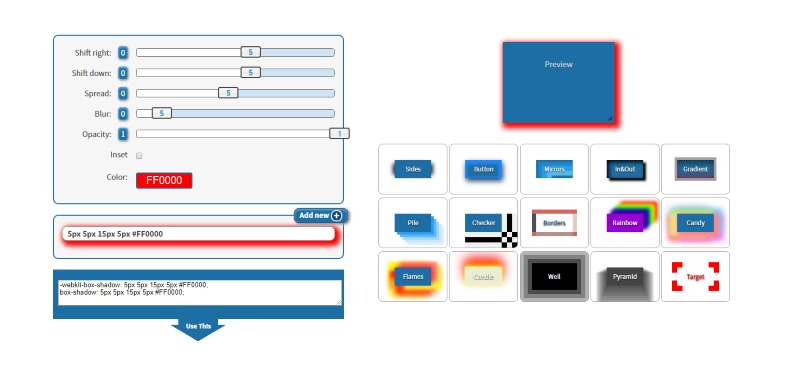
Box-Shadow CSS Generator
| Object: | |
| Background: |
Effect Gallery
Set the properties of your box shadow to get the CSS style.
Use the sliders and the color picker to set the values and watch the live preview until you reach the desired effect. Select the right-down shift, spread, blur, opacity, color.
Pick a custom color for the preview background and your object.
Pick a design from the effect gallery to understand the unlinited possibilities you can create with this CSS property.
Add Multiple Box-Shadows
Web browsers allow us to add more than one shadows to our design and so does this online tool. Use the Add new button to save the current line and set up a new one. You can later discard them if you don't like one any of them.
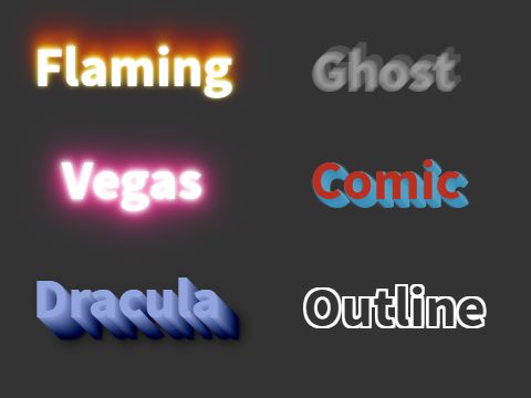
Text Shadow
Compose your own or pick
one from the gallery.
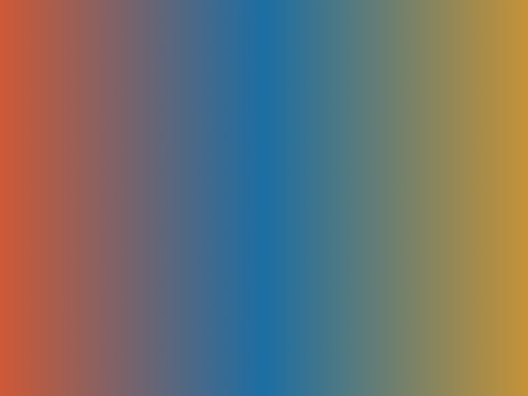
Gradient Generator
Pick the colors and
set the gradient type.
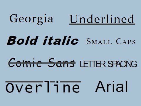
Font Styler
Select a font family
and style it easily.
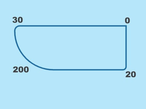
Border Radius
Enter the four corners
to get the styles.