Text Shadow CSS Generator
| Text: | |
| Background: |
Effect Gallery
Pick a predefined style from the gallery or generate a text shadow with your preferences. Set up the desired attributes to get the CSS code.
Shift the shadow right/down, set the blur and opacity and pick a color from the palette to get your CSS. Use the online editor to adjust your style manually. Follow the evolution of your shadow in the live preview where you can set a custom text and background color.
Just like the box shadow generator, this tool also allows you to add multiple shadows to your design with the Add new button. Create amazing projections define an unlimited list of dark areas or shapes produced by a body coming between rays of light and a surface. Check out the effect gallery for inspiration and to see how they're built. Click one of them to populate the editor and to adjust their design. Picking an item from the gallery will erase your current work progress without any warning.
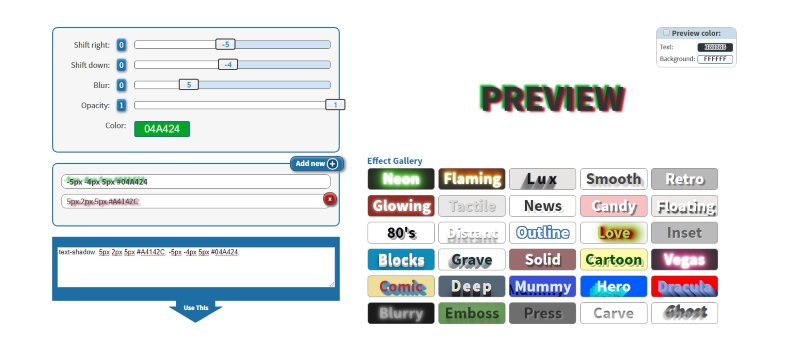
Please note that the last five items in the gallery (Blurry, Emboss, Press, Carve, Ghost) can't be adjusted once the're loaded to preview because they use alpha channel colors and other attributes not supported by this website. For example the "Ghost" design has a completely transparent text color and all the visible and readable part is composed of shadows. Another item, called "Carved" is also transparent, and is using the background-clip: text which shows the background only where the text is.
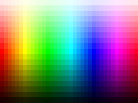
Color Picker
Mix RGB, HSV, CMYK colors,
or pick one by name.
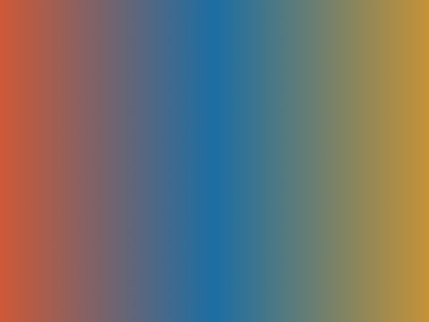
Gradient Generator
Pick the colors and
set the gradient type.
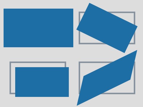
Box Transform
Scale, rotate, translate and skew
elements with CSS.
Border Radius
Enter the four corners
to get the styles.