Transform CSS Generator: Scale, Rotate, Translate and Skew
Use the sliders to set the transform CSS properties for your stylesheet.
Set the scale, rotate, translate, and skew and watch the live preview to get the desired view.
Avoid setting extreme values for the skew property because the preview might cover the settings panel. In this situation you will have to refresh the page.
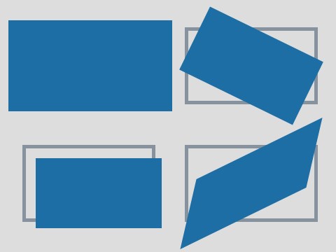
Scale, Rotate, Translate and Skew
Scale works like you would zoom in and out the targeted element. The default scale value is 1, which works as a multiplier of the original size. This means that 0.5 halves while 2 doubles the section.
Rotate the element clockwise with the second property that's set in degrees. Turning with 180° puts the object upside down while 360° takes is back to its original upright position. Set any positive or negative value or even decimals.
Translate shifts the element with pixels related to its original position. The X value horizontally while Y vertically when there rotate attribute is zero.
Skew the objects on their horizontal (X) or vertical (Y) axle.

Gradient Generator
Pick the colors and
set the gradient type.
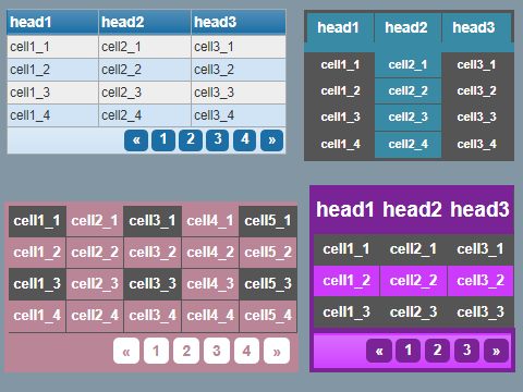
Table Styler
Generate HTML and CSS
for tables and div grids.

Border & Outline
Style the line surrounding
the elements in your doc.

Box Shadow
Generate box-shadow
with the desired options.